
Photography
Capture the moments
The ones that happen rarely
For the perfect shot
- By Kim Rivera

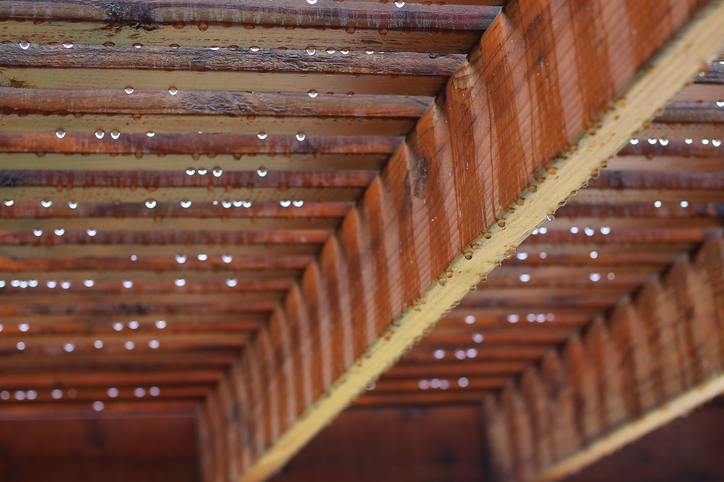
Line
Elements of Art
All the Pieces/Parts Making Up an Image Composition
1.Line: Leading lines and using triangles, squares, circles which are made up of lines. Tip: use lines that draw a viewer’s eyes into a composition and point them in the direction of the main subject of the photo—“leading lines”
- This image has rows of lines, they cross each other creating more lines in the image.
2.Shape: created when shapes are seen as 3-dimensional in an image. This creates depth and distance in a composition. Tip: correct placement of forms create depth and generates more of an interest in a composition by pulling your viewer into the image
- This image of the fountain button is shaped as a circle with 4 more circles on it and around it.
3.Form: created when shapes are seen as 3-dimensional in an image. This creates depth and distance in a composition. Tip: correct placement of forms create depth and generates more of an interest in a composition by pulling your viewer into the image
- This image is 3D because the plants repeat themselves
4.Space: the area of an image taken up by elements (positive space) or the open area around or between elements (negative space) . Tip: use open spaces that have little in them to create more focus and emphasis on the subject of the image—“negative space”
- This image uses negative space from inside the bowl which makes the water look red.
5.Texture: surfaces shown in an image that suggest to our perception and memories of touch, taste, and/or smell—this makes a photograph seem more “real” and give a life-like impression/feeling. Tip: good use of texture creates a stronger connection for a viewer to a composition
- This image has textures like the sun, smooth clouds, and the rough leaf's of the tree.
6.Color: the amount of light in an image in terms of hue (type of color) and saturation (amount of the hue)…black and white has color in terms of shades of gray. Tip: there needs to be the perfect balance of color: not enough and the image is boring, but too much and the image looks unrealistic
- This image has lots of color from the birds feathers, there are different colors in each spot of the birds body
7.Value: the quality of light vs. dark (brightness and shadows) by using bright colors or softer color tones; or the lighting contrast tones in a black and white image…this is the “pop” that an image has to the eye…Tip: always remember that this is the first impression of an image for a viewer, it “wows” the viewer and should be used to capture their attention immediately
- This image is darkened in the back but brightened in the front where the flower is.